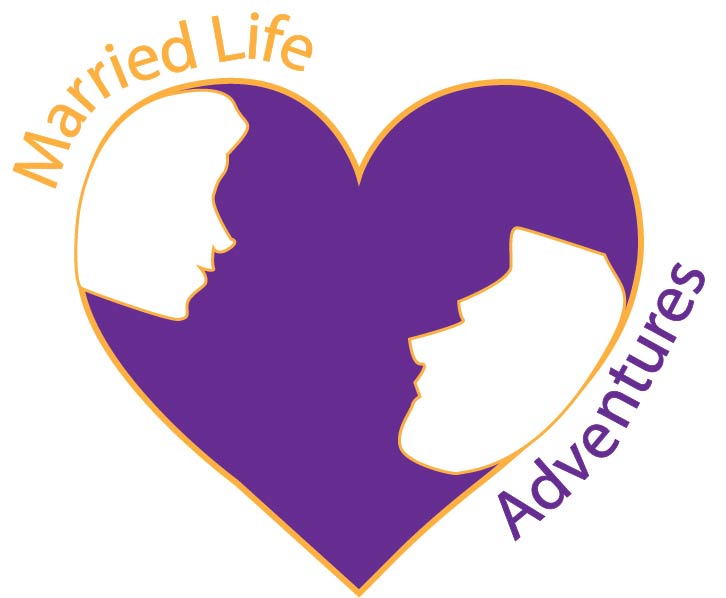
I had many inspirations for my logo. I wanted it to represent who I was and what I thought about marriage in general. The colors I thought of were purple and gold. These colors represent royalty and also stand out to me. I wanted those colors to represent rich in love and happiness. The silhouette represents husband and wife and the heart represents love. It was also an inspiration of the Yin and Yang symbol.

I started off using the pen tool and did an outline of a heart. I changed the stroke to make the lines slightly thicker. I also found a silhouette of a man and woman on the Vector Stock website which I cited below. I then used the pen tool to outline part of their faces and some of it was free handed. I then used the selection tool to drag both outlines into the heart. I also used the direct selection tool to make my outlines align more with the heart. When deciding on the colors of each part, I wanted my silhouette to truly be a silhouette. I left them hollow but with a .75 stroke outline in gold to make them stand out with my purple filled heart.

Using the text tool, I made too different portions when spelling out my title. I wanted my wording to curve along the heart. I then used the selection tool to place both portions where I wanted and then used the direct selection tool to start a path. I have learned there are multiple ways to add text along or even on a path. I then used the anchor points to stretch them out further and making it have no strokes, so it was invisible to see. For the font style I went with Georgia because it’s a sans-serif font and is also easily readable to any audience. I also went with a larger font size of 48 so it’s easier to see, even from far away. I think my logo design would look well either small or large or even on a business card because it can pair well on any white surface, and it stands out. My text around the heart is not exactly perfect on purpose. The purpose of this was to represent marriage having ups and downs in life, but looking to one another for guidance and love along the way. I thought that could be a fun element to add into my logo piece and still making it simple.
My overall inspiration came from that of my blog post which i will cite here. I also got some inspiration with color from a helpful video that provided information about color combinations. This will also be cited below.
Please feel free to give any feedback and advice you may have on my logo below. 🙂
I like how you incorporated the purple and gold because like you I think of royalty I see them. The different strokes you used in the heart makes it stand out more and draws you in. The only thing I think I would change is the word adventures, I would it down towards the bottom of the heart a little. It looks a little off center to me. Great work over all!
LikeLike